grote font
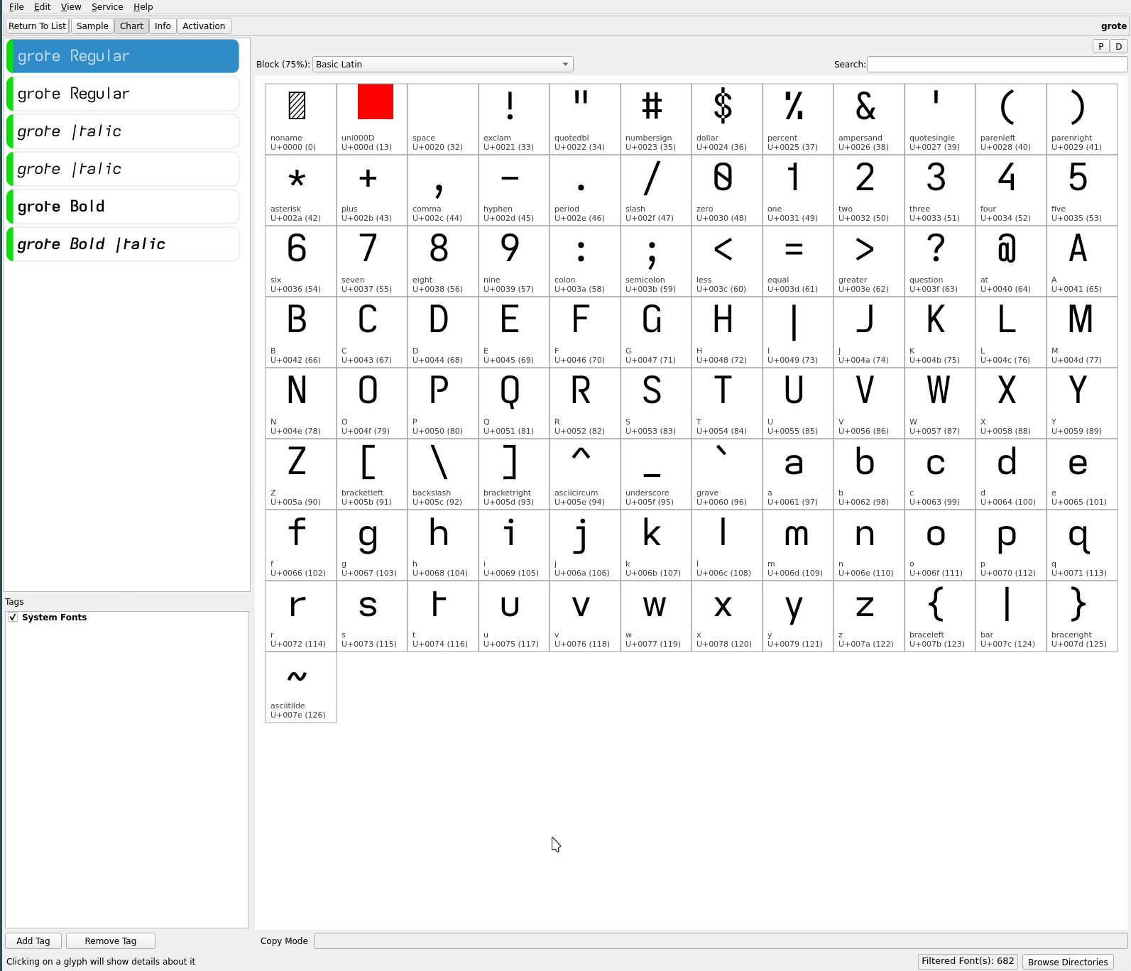
The asymmetrical lower case t of the groot and related fonts is, quite possibly, the final glyph substitution (available from the Iosevka project) to aid dyslexic readability. groot IMO is both a beautiful and highly legible font with its dyslexic glyph choices (though, some may prefer earlier glyph choice combinations that have been created :).
Up until now, all the fonts described here have all been derived from the Atkinson Hyperlegible font, with problematic glyph shapes tweaked for dyslexia. Ever passionate about the early Bauhaus period of font design, in particular, with the Futura font and its contemporary, the Jost font, i decided to create the grote font which edges ever more towards these sans serif fonts with maximal openness and geometric simplicity. Notably, the character cell filling “hook” of the lower case l and t are replaced with serifless glyph shapes to reflect a more grotesque heritage..

Similarly, the straight-turn of the lower case y simply becomes straight—aligning with the Bauhaus flavor of the font, further distancing from its Atkinson Hyperlegible origins. The lower case q does continue to retain its hook as part of the b d p q dyslexic glyph set—dyslexic readability still a focus of the font.
The serifless lower case l which is indistinguishable with the serifless capital I of the Futura font is clearly avoided by the grote font’s unique descending capital I. Strikingly, the familiar serifless crossed lower case t (of Futura) is replaced with the asymmetrical hookless glyph—which is less “dense” than the traditional crossed t, creating an even more open typeface (when combined with the serifless lower case l)—albeit, at the expense of familiarity (though, arguably more distinct).
It is stark with its geometric emphasis and has a completely different feel to the groot font. The added air emphasizes the sans serif sensation (even if the lower case i j are not—these remain serifed for maximum readability at small font sizes, the serif distinguishing their dot)..

The hookless asymmetric t takes a bit of reading time to get used to, being an uncommon glyph shape. But the increased openness produced with its utter geometric simplicity and the visual motion of its shape impart a heightened sans serif look. The loss of the glyph hooks, turns and crossing strokes which are present in the Atkinson Hyperlegible font—the capital G, lower case l t y and 4—open up the grote font significantly (even compared to the groot font), strengthening its geometric cast—this does come with a somewhat reduced legibility for the visually impaired. The open capitals B P R and 4 complete the modern flair of the typeface.
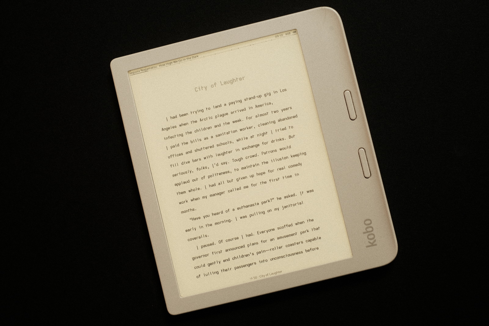
It is not a typeface for everyone, unlike groot or stria—which is a lovely complement to the grote—which i am certain will have broader appeal. Before these font explorations, Futura was my go to typeface on my ereader. Now it feels like i have come full circle and then some. i’ve been reading with it for several days now nonstop and find it completely interchangeable with groot for ease on the eyes—it is a serendipitous geometric complement to the fonts created to date. If you’ve ever loved Futura and similar open geometric fonts, then this monospaced dyslexia tweaked font may appeal :)
repos
The current ereader fonts—including the asymmetric t variants—may be found on OneDrive.